July, 2020 Winners. Judges comments follow names.
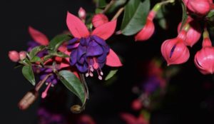
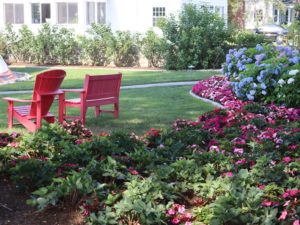
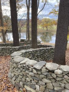
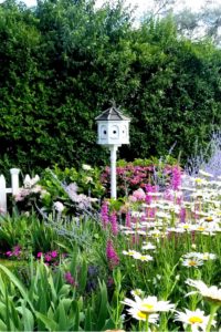
Class 1. A photo highlighting a special garden feature, tree, plant or flower.
1st Diane Deegan. Technical perfection!
2nd Krstyna Vaughn. Creative choice of composition. Overexposed background detracts from distinction.
3rd Jane Waugh. Intriguing linear contrast of curved walls and vertical trees. Does not conform to class title.
HM Susan Emmetsberger. Excellent.
- 1st: Diane Deegan – Fuscia.
- 2nd: Krstyna Vaughn – 2 Chairs.
- 3rd: Jane Waugh – Stone Wall.
- HM: Susan Emmetsberger – Birdhouse.
Class 2: A still life with static, inanimate elements telling a story.
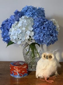
1st Barbara Deysson. Thoughtful repetition of vibrant color and placement of elements create rhythm among a well-framed grouping of elements.
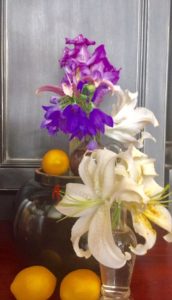
2nd Soudi Salek. Vibrant use of color; impressionistic which invokes the theme of the class. Framing at the right edge detracts from the overall composition.
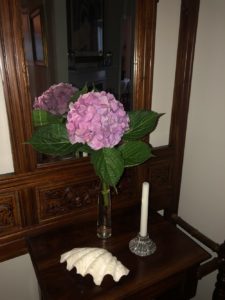
3rd Meg Kelley. Creative use of mirror imaging adds good contrast. Design elements do not fill the space in the upper portion of the photo.
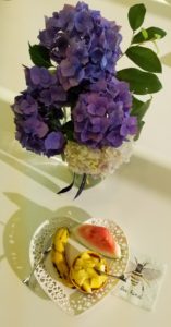
HM Susan Emmetsberger. Vibrant hydrangea color and interesting use of shadow. The two major elements are lacking a connection in the composition.
- 1st: Barbara Deysson – Hydrangea with Owl.
- 2nd: Soudi Salek – Gladiolas, Oranges.
- 3rd: Meg Kelley – Pink Hydrangea with Candle.
- HM: Susan Emmetsberger – Hydrangea with Plate.
Class 3: A flower from another point of view – macro, manipulated, deconstruction or abstracted images.
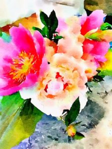
1st Rusty Ruth. This watercolor like photo used creative software photo editing.
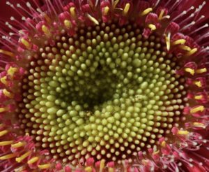
2nd Diane Deegan. Creative capturing of color and texture. Symmetry detracts from the “Wow” factor.
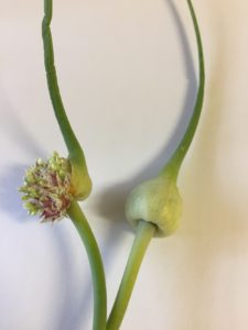
3rd Amanda Cook. Pristine, artistic composition with interesting use of shadow in this more traditional interpretation of the class. The wrinkling of the upper left portion of the onion is distracting.
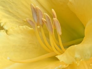
HM Maureen Carson. Nice depth in this Georgia O’Keefe-like photo. The relative empty space on the left side of the photo does not balance all the the interest, color and lovely
curve on the right side.
- 1st: Rusty Ruth – Waterlogue Technique.
- 2nd: Diane Deegan – Gerbera.
- 3rd: Amanda Cook – Allium sativa.
- HM: Maureen Carson – Hemerocallis.
Class 4: A photo highlighting a pollinator. Must show some horticultural material.
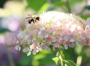
1st Krystyna Vaughn. Good composition with stunning use of delicate lighting: effective use of focus as a technique.
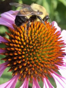
2nd Janet McCabe. Effective use of color contrast; outstanding clarity of detail and focus. Slight dominance of the flower.
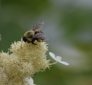
3rd Diane Deegan. Artistic camera technique in use of focus; single featured flower creates interest. Volume of space on the right side negatively impacts balance within the photo.
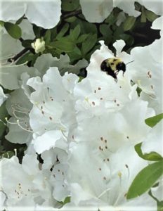
HM Ruth Chiles. Lovely contrast and rhythm of the plant material. Pollinator not emphasized as much as the class title suggests.
- 1st: Krystyna Vaughn – Bumblebee on Pink. Hydrangea.
- 2nd: Janet McCabe – Bee on Echinacea.
- 3rd: Diane Deegan – Bee on White Hydrangea.
- HM: Ruth Chiles – Bee on Azalea.
Class 5: A photo showing a garden water feature.
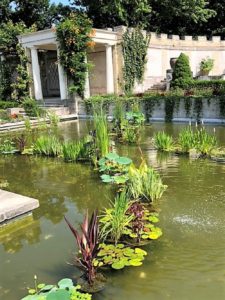
1st Ruth Chiles. Variety of colors, shapes and angles makes this a captivating photo. One’s eye moves through the composition from the cement corner in the foreground to
the grateful arc of water plants in the middle, to the building in the background.
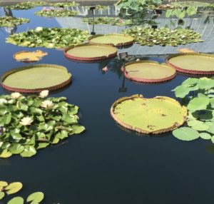
2nd Barbara Deysson. Huge lily pads are eye-catching, and deep black water in foreground emphasizes scale. Off-center reflection of building and person in background weakens
overall composition.
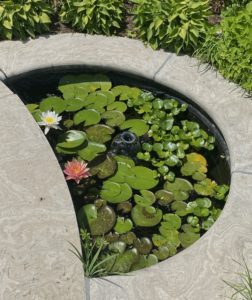
3rd Jane Waugh. Peaceful setting. Odd angle crops cement pond framing, impacting visual effect.
HM Janet McCabe. Out-of-focus water feature is subordinate to dominant plant material.
- 1st: Ruth Chiles – Untermeyer Gardens.
- 2nd: Barbara Deysson – Lily Pads.
- 3rd: Jane Waugh – Garden Pond.
- HM: Janet McCabe – Red Mandevilla.
6. A horticultural exemplar – an image judged for its showmanship. In other words, something you would enter in a show. Name of plant material must be included.
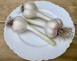
1st Maureen Carson. Pristine garlic entry, expertly presented. Photography technique captures the perfection of the entry.
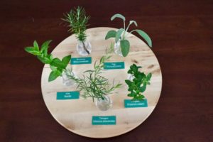
2nd Krystyna Vaughn. Lovely herb collection and nicely presented. The lack of a closer perspective and slightly less clear focus detracts from the collection.
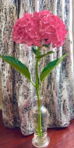
3rd Soudi Salek. A very nice hydrangea specimen. Patterned background detracts from the attributes of the flower.
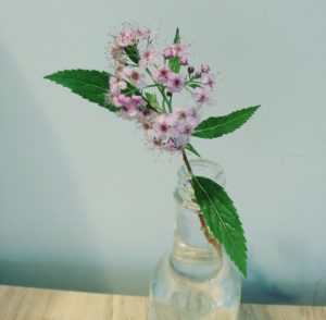
HM Anne Cheng. A very sweet spirea entry.
- 1st: Maureen Carson – Garlic.
- 2nd: Krystyna Vaughn – Herb Collection.
- 3rd: Soudi Salek – Hydrangea.
- HM: Anne Cheng – Spirea.
—————————————————————————————————————-

